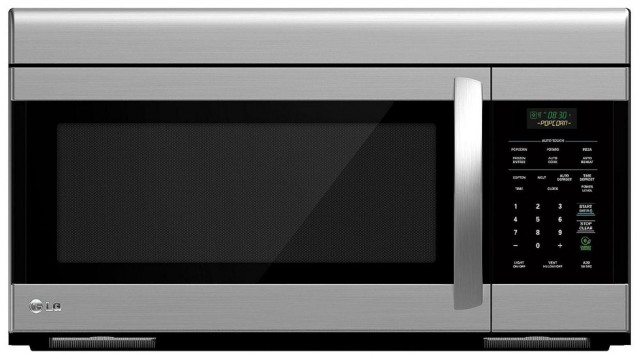
Most microwaves that you find in the store have a user interface that is so terrible, I can only assume that it was designed by a committee of middle managers who don’t even know the meaning of the term “user interface.”
Allow me to explain. Here are a few examples of your typical microwave:
This LG microwave has 31 buttons. Thirty-one (non-tactile) buttons, when all I want to do with a microwave is heat up food for a specified amount of time..
Talk about overkill.
This Jenn-Air microwave sports 34 buttons. Thirty-four buttons! The microwave in my kitchen at home is a similar Jenn-Air model, also with thirty-four flat, zero-feedback buttons. The vast majority of the time, I use exactly two of these buttons: “Add 30 Sec.” (which also starts the heat) and “Stop / Cancel.” For those of you keeping score at home, that makes 94% of the buttons on my microwave a total waste of space.
Combine an excess of useless buttons with a completely flat surface that has zero tactile feedback, and you’ve basically designed the worst interface possible. Which comes standard on most microwaves. For some reason.
Let’s say I’m watching a movie in the next room over and would prefer not to divert my eyes from the screen and turn on the kitchen lights just to reheat my tea. Too bad. Thanks to the totally flat, non-tactile button style that has somehow become standard on microwaves, coupled with how tiny each button needs to be in order to fit that many buttons on the face of the microwave, hitting the correct buttons to heat your food or drink requires a well-lit room and your full attention.
Thankfully, microwave user interface design is not a completely lost cause… You won’t usually find them on the shelves of your local Sears or Target, but there are some microwaves that manage to avoid “death by mega-button-pad.”
This is the microwave in the kitchen at my office. It’s definitely a step in the right direction, with 14 raised tactile buttons plus a simple knob, but most of the buttons are still completely superfluous. What the heck is “Inverter Turbo Defrost” or “Inverter Melt & Soften”? No doubt some microwave engineer worked long hours coming up with these clever features, but seriously… why?
I don’t need my microwave to “sensor cook” my food. I don’t need it to tell me the time. I don’t need an entire button dedicated to “Pizza Slice” (I kid you not, that is a button on my microwave). I just need it to heat up food for a specified amount of time.
The really strange thing is that things have not always been this dire when it comes to microwave UI. Here’s a typical microwave from the 1970s:
That’s more like it. Two knobs and three nice, big, tactile buttons. It doesn’t get much more simple than that. Okay, well maybe it does…
I have been able to find one currently-available microwave that satisfies my simple use requirement of “heat up food for a specified amount of time” in the most elegant way possible. A microwave that sports a user interface that’s actually an improvement over microwaves of forty years ago, instead of a dozen giant steps backward.
Behold the Sharp 1000W/R-21LC:
One knob. That’s the entire user interface. Zero buttons. Zero fancy-sounding features that never get used. Just turn the knob to the desired time, and the microwave heats the food. Lights blink around the knob to indicate how much time remains. So simple, so elegant.
I purchased this UI masterpiece at a surplus store, but I have also seen them at a “business” Costco in my area, or you can get it at Amazon for $280.
Unfortunately, it doesn’t come in an over-the-range style, so I won’t be able to replace the 34-button monstrosity in my kitchen just yet. For now I’ll have to be satisfied with only having a microwave that’s actually user friendly in the basement, but since that’s where I’m relocating my movie room to anyway, that will do nicely.
The post Why do most microwaves have such a terrible user interface? appeared first on Tim and Jeni.


